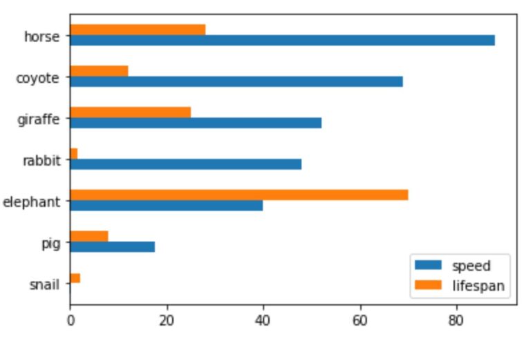
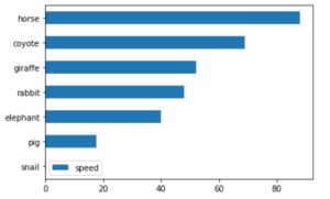
A horizontal bar plot is a plot that presents quantitative data with rectangular bars with lengths proportional to the values that they represent.
A bar plot shows comparisons among discrete categories. One axis of the plot shows the specific categories being compared, and the other axis represents a measured value.
Parameters:
x: label or position, optional – Allows plotting of one column versus another. If not specified, the index of the DataFrame is used.
y: label or position, optional – Allows plotting of one column versus another. If not specified, all numerical columns are used.
color: str, array-like, or dict, optional
The color for each of the DataFrame’s columns. Possible values are:
A single color string referred to by name, RGB or RGBA code,
for instance ‘red’ or ‘#a98d19’.
A sequence of color strings referred to by name, RGB or RGBA
code, which will be used for each column recursively. For instance [‘green’,’yellow’] each column’s bar will be filled in green or yellow, alternatively. If there is only a single column to be plotted, then only the first color from the color list will be used.
A dict of the form {column namecolor}, so that each column will becolored accordingly. For example, if your columns are called a and b, then passing {‘a’: ‘green’, ‘b’: ‘red’} will color bars for column a in green and bars for column b in red.
**kwargs – Additional keyword arguments are documented in DataFrame.plot().
Returns:
matplotlib.axes.Axes or np.ndarray of them – An ndarray is returned with one matplotlib.axes.Axes per column when subplots=True.