This function is useful to plot lines using DataFrame’s values as coordinates.
Parameters:
x: label or position, optional –Allows plotting of one column versus another. If not specified, the index of the DataFrame is used.
y: label or position, optional – Allows plotting of one column versus another. If not specified, all numerical columns are used.
color: str, array-like, or dict, optional –The color for each of the DataFrame’s columns. Possible values are:
A single color string referred to by name, RGB or RGBA code,
for instance ‘red’ or ‘#a98d19’.
A sequence of color strings referred to by name, RGB or RGBA
code, which will be used for each column recursively. For instance [‘green’,’yellow’] each column’s line will be filled in green or yellow, alternatively. If there is only a single column to be plotted, then only the first color from the color list will be used.
A dict of the form {column namecolor}, so that each column will be
colored accordingly. For example, if your columns are called a and b, then passing {‘a’: ‘green’, ‘b’: ‘red’} will color lines for column a in green and lines for column b in red.
**kwargs –Additional keyword arguments are documented in DataFrame.plot().
Returns:
matplotlib.axes.Axes or np.ndarray of them – An ndarray is returned with one matplotlib.axes.Axes per column when subplots=True.
(2) Examples Of plot.line() Method:
Example-1:
s = pd.Series([1, 3, 2])
s.plot.line()
Output:
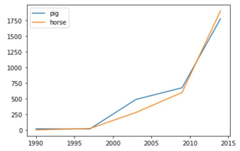
# The following example shows the populations for some animals over the years.